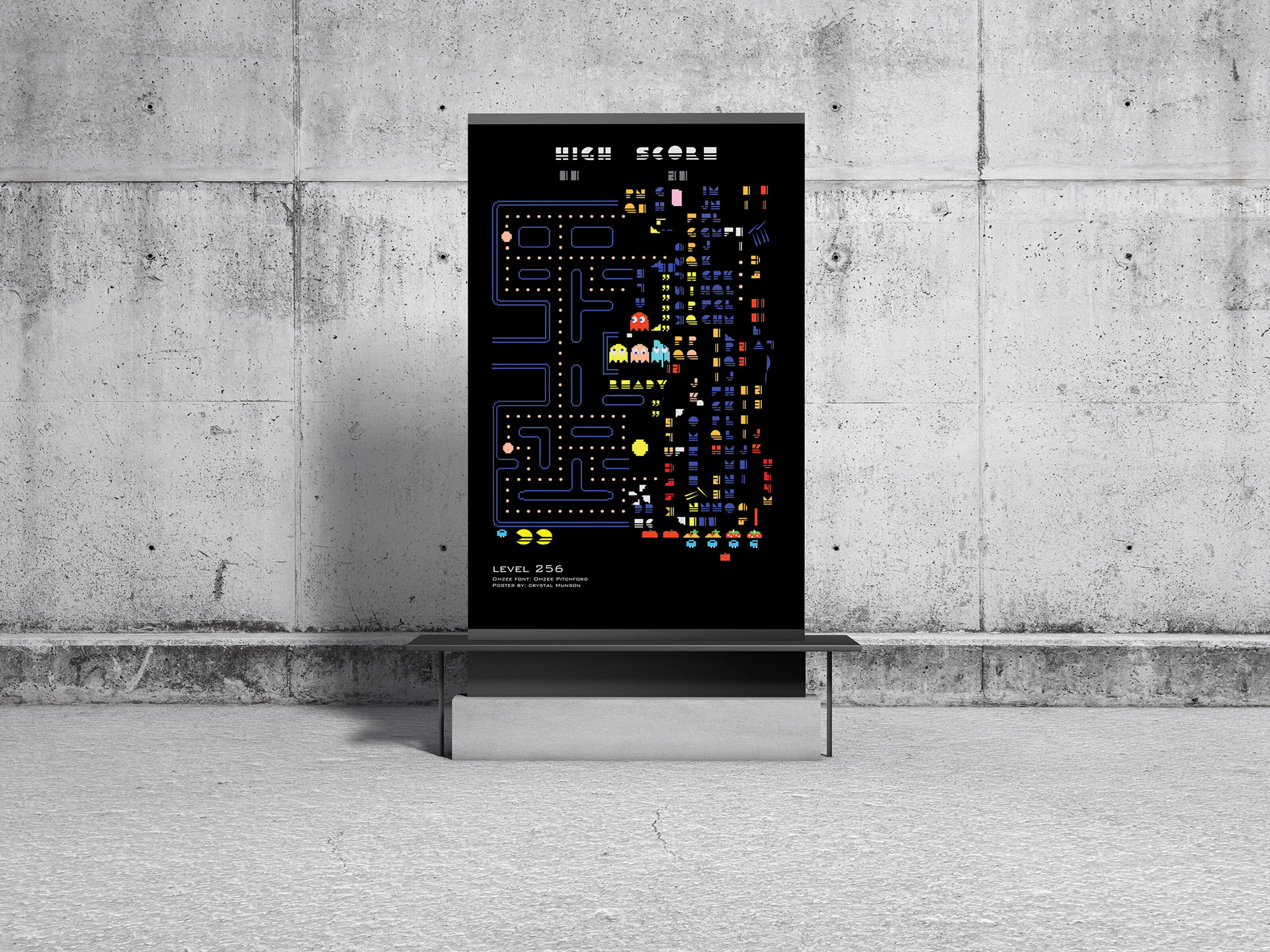
Featured on AIGA Los Angeles' Instagram on December 16, 2020, to celebrate Pac-Man's induction into Comic-Con's Hall of Fame.
Who doesn't love Pac-Man? While the majority of people know of the Pac-Man game, only true gamers know of level 256: the Pac-Man kill screen. To achieve a perfect Pac-Man score of 3,333,360 you need to navigate 256 boards, or levels, and eat every fruit, pellet, and ghost -- all without dying. If that sounds impossible, that's because it is. Pac-Man has a bug in it that prevents it from being completely finished. This bug occurs at the 256th board, where it will cause an overflow in the 8-bit byte distinct values. As a result, the final board is almost unplayable, with the right half replaced by a series of scrambled symbols, garbage tiles, and letters.
Looking at the Omzee Font, I was reminded of the '80s. Being born in 1981, I got to experience the glory of the '80s: Hyper-color shirts, the moonwalk, Walkmans, MTV, the Rubik's Cube, Trapper Keepers, Nintendo (and blowing in the cartridges to make them work), arcades, and Pac-Man. The Omzee Font "C" glyph reminded me of Pac-Man so I dove into research. There is a lot of information out there on Pac-Man! The story of how the game came to be, the four original ghosts (Blinky, Pinky, Inky, and Clyde), the many ghosts that came after, and so much more. I learned of level 256 and the kill screen shortly after beginning my research. This led me to the idea of incorporating the Omzee Font into the Pac-Man screen. Initially, I planned to use an image of the Pac-Man screen then mask out part of it and put the Omzee Font glyphs on top. That seemed too easy. I was just getting the hang of Illustrator and wanted to push myself so I decided to digitally draw every part of the screen. I had a blast creating the poster and learned many new illustrator techniques along the way.